ASTRACON-News
O.T.S. ASTRACON starts roll-out for its new brand identity
As a company in the transport and logistics sector, we have evolved into an internationally established service provider for customers from trade and industry since the company was founded in 1994. O.T.S. ASTRACON offers reliable and demand-oriented services in the forwarding sector in the special fields of air freight, sea freight, overland transport and logistics services.
We are known as a long-term reliable and independent partner. Every day we give our best for our customers – with pronounced flexibility, keen team spirit and a genuine passion for logistics. We are proud of this corporate culture. It creates the perfect basis to guarantee the top performance of our teams day after day.

We keep the proven
“O.T.S. ASTRACON” – the name remains! We are as always “the O.T.S.” or “the ASTRACON”, because that is how we are known by lots of people and that is how we have been able to establish ourselves in the international market.
“AIR+SEA TRANSPORT SYSTEMS” – we are and will remain your enablers in the field of both air freight and sea freight and ensure the implementation of worldwide transport needs and logistics services along the global supply chain with system.
The traditional colors red and blue also remain an integral part of our corporate identity.
We continue to maintain our strengths on a growth course and remain your independently acting medium-sized company – independent of the interests of third parties. And of course we will stick to our personal and customer-oriented service, for which our customers appreciate us so much.
We dare the new
What we have been achieving for decades is now becoming more evident. First and foremost, our performance strength and expertise in air freight and sea freight, but especially the adaptability to changing market requirements and the high flexibility of our solutions.
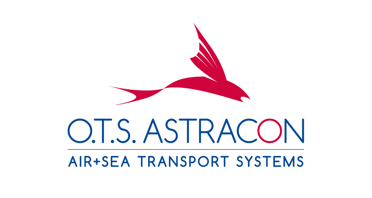
The core element of the new design is a modernized logo.
The distinctive logo element of the flying fish is a symbol of our agility, the vitality of the company and the dynamism of O.T.S. ASTRACON services. With our new brand design, we also create a clear visual distinction from the competitors – as demonstrated daily with our market-oriented customer service. The new logo stands for the successful further development and continuous transformation of our company, which today goes far beyond pure forwarding services. It stands for our ability to permanently develop further and to grow beyond ourselves with great enthusiasm.
“We are building a bridge between tradition and modernity. The new brand identity preserves the origins of our brand while executing the next step into the future to become a modern and sustainable company.”
Michael Steingens
Managing Partner & CEO
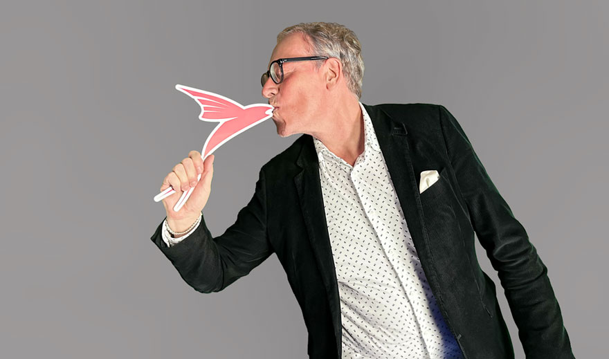
“We are building a bridge between tradition and modernity. The new brand identity preserves the origins of our brand while executing the next step into the future to become a modern and sustainable company.”
Michael Steingens
Managing Partner & CEO
The renewed look also goes hand in hand with a new digital presence – we have greatly expanded the content of our website, added tools to important service areas (e.g. shipment tracking, freight portal, container dimensions) and further professionalized it.
The new brand identity of O.T.S. ASTRACON will be gradually rolled out across all means of communication and in all branches from January 2023.
More news
Read more news
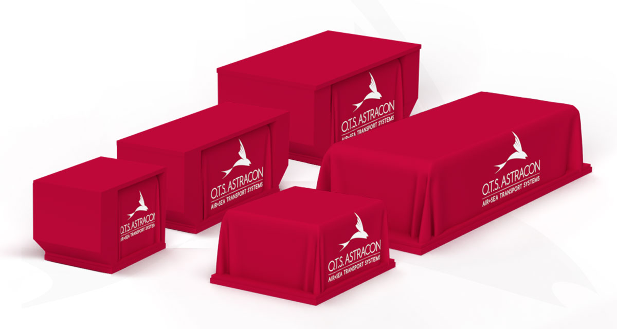
Visit our info page on Unit Load Devices and expand your cargo knowledge.
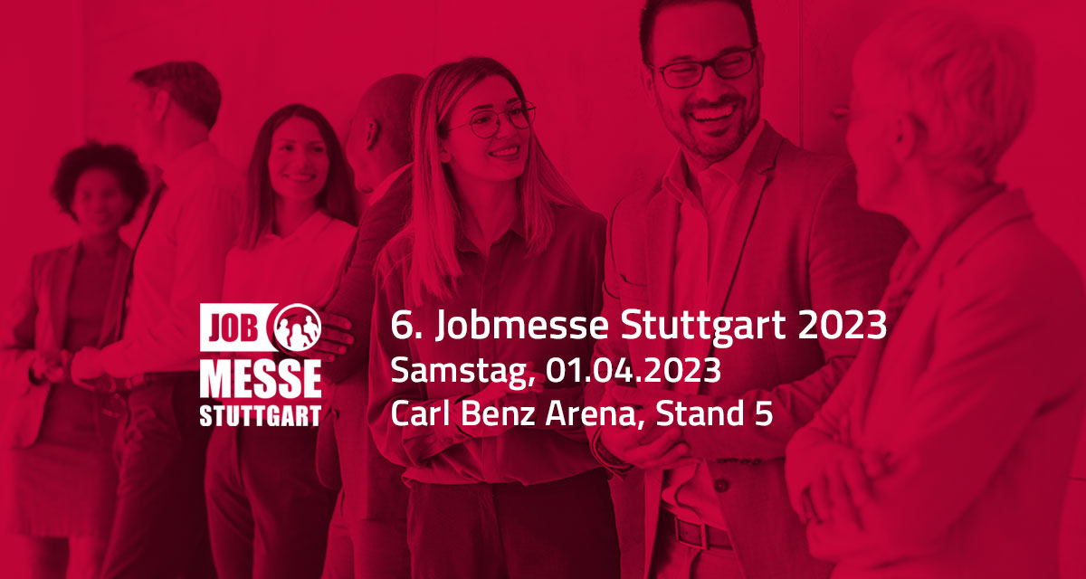
First-hand job and training information - visit O.T.S. ASTRACON on April 1, 2023 at the 6th Jobmesse in Stuttgart.
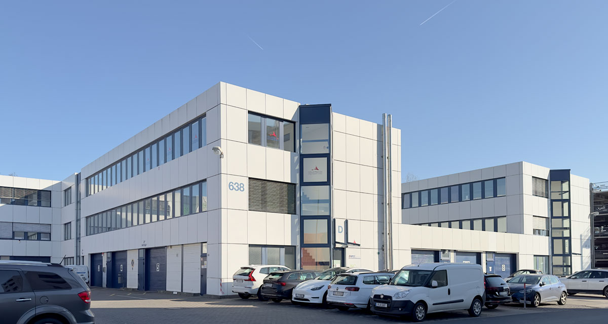
Our Frankfurt branch at the important hub for international air freight presents itself.
